


At a Glance: Napkin Color by Tablecloth
|
Your Tablecloth |
Best Napkin Colors |
Avoid |
|
White or ivory |
Navy, sage, dusty rose, charcoal, black, natural linen, champagne |
Pale ivory-on-white (too little contrast) |
|
Natural linen/beige |
White, dusty blue, rust, sage, charcoal |
Very pale shades that vanish into the beige |
|
Navy blue |
White, ivory, champagne, pale gold |
Navy-on-navy |
|
Black |
White, ivory, gold, silver, champagne |
Charcoal or dark grey (too close in value) |
|
Sage green |
White, ivory, rust, terracotta, deep green |
Mint-on-sage (too similar) |
|
Burgundy |
Cream, ivory, champagne, soft gold |
Bright red (competes rather than complements) |
|
Patterned/floral |
One solid color pulled from the print |
A second pattern |
Cloth napkins sit closer to your guests than almost anything else on the table in their hands, on their laps, and in every photo of the place setting. Get the color right, and the table feels finished. Get it wrong, and something feels slightly off, even if no one can say exactly why. Here is a complete, no-guesswork guide to picking the right shade every time.

The One Rule That Makes Every Napkin Color Decision Easier
Before anything else, remember this: your napkin should contrast with your tablecloth, not match it. A napkin in the same color as the tablecloth disappears into the surface; there's nothing for the eye to land on, and the table reads as flat rather than styled. Even a subtle difference (a warm ivory napkin on a bright white cloth or a pale blue napkin on a navy cloth) is enough. The contrast doesn’t need to be dramatic; it just needs to exist.
Match Your Napkin Color to Your Tablecloth
White or ivory tablecloth: the most forgiving starting point. Navy, sage, dusty rose, charcoal, terracotta, and natural linen all work beautifully. For formal settings, pale gold or champagne napkins on white read as quietly upscale.
Natural linen, beige, or cream tablecloth: These warmer neutrals pair beautifully with earthy shades like rust, sage, warm ochre, and dusty blue. Avoid very pale colors that blend into the tablecloth, and choose napkins with enough contrast to make the table setting stand out.
A solid-color tablecloth: pull either a complementary tone (similar depth, different hue—a deep navy cloth with a cobalt napkin) or a true contrast (a navy cloth with crisp white or gold napkins). Match intensity: rich colors pair with rich colors, and soft pastels pair with other soft pastels.
A black tablecloth: go light and warm; white, ivory, champagne, or metallic gold and silver all create the strongest, most elegant contrast. Charcoal or dark grey napkins sit too close in value to black and will look muddy rather than intentional.
A patterned or printed tablecloth: let the pattern lead. Pull one solid color out of the print for your napkins rather than introducing a second pattern, which tends to look busy instead of styled.

Choose by Occasion
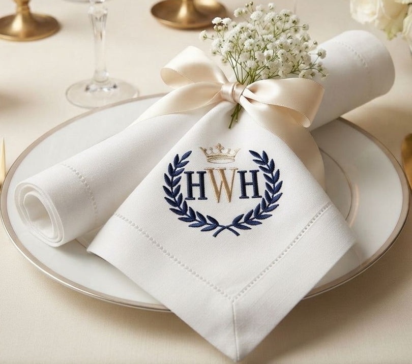
For formal dinners, restraint wins: white, ivory, ecru, champagne, and black are the timeless choices because they don’t compete with the food, flowers, or conversation. A white hemstitch-edge linen napkin on a white or cream cloth is still the gold standard.
For everyday family dining, practicality matters as much as looks. Mid-tones and darker shades—terracotta, deep sage, dusty blue, warm ochre, and natural undyed linen—hide daily wear and stains far better than pure white, and they feel far less precious, which means you’ll actually use them.
For casual entertaining, you have the most creative freedom. A mix of two or three coordinating napkin colors at one table (rather than one uniform set) is a genuinely popular, deliberate-looking styling choice; just keep the palette to two or three tones so it reads as curated rather than mismatched.
For weddings, the napkin sits at the center of nearly every place setting and appears in almost every reception photo, so it should flow directly from your wedding palette: blush or champagne for romantic/classic weddings, crisp white or ivory with a strong hemstitch for modern minimalist weddings, jewel tones like emerald or plum for glamorous weddings, and sage or terracotta for garden and boho weddings. Always check your chosen color under the venue’s actual lighting before finalizing; colors shift noticeably between daylight, candlelight, and reception lighting.
For outdoor and al fresco dining, mid-toned, naturally inspired colors work best: sage, dusty blue, terracotta, and warm tan because they hide dust and pollen far better than pale shades, and cotton or linen in these tones launders easily after outdoor use.
You May Also Like Beautiful Thanksgiving Tablecloths to Showcase Your Feast
Choose by Season
Spring calls for soft, fresh tones: mint green, pale blush, powder blue, soft lavender, and warm white. Summer can afford more confidence: bright coral, warm yellow, turquoise, and tropical greens all feel energetic, while crisp white on natural linen stays cool and refined. Autumn is the richest palette of the year: burgundy, burnt orange, amber, olive, and chocolate brown all read as warm and generous. Winter splits into two directions: deep red, forest green, and gold for festive warmth, or icy blue, silver, and charcoal for a cooler, more contemporary look.

Choose by Holiday
Thanksgiving:
Deep rust or burnt orange napkins on a natural linen or warm white tablecloth is the single most reliable combination for a harvest table that photographs well without feeling like a costume.
Christmas:
Classic deep red or forest green against white or ivory is timeless; for a more contemporary holiday look, swap in gold or silver metallics against a charcoal or navy cloth.
Easter:
Soft pastels—blush, mint, powder blue, and pale yellow—on a white or natural linen tablecloth keep the table light and spring-appropriate.
Halloween:
Black napkins against a deep orange, plum, or charcoal cloth create drama without tipping into costume territory; adding a single metallic accent (gold or copper) keeps it elegant rather than kitschy.
New Year’s Eve:
Metallics—gold, silver, or champagne against black or white—read as celebratory and are one of the few times a fully monochromatic, high-shine palette works well.
A Quick Lesson in Color Theory for Your Table
You don’t need a design degree to use color theory well, just three terms. Complementary colors sit opposite each other on the color wheel (navy and warm gold, terracotta and sage) and create the most energetic contrast. Analogous colors sit next to each other on the wheel (sage and warm yellow, dusty blue and lavender) and create a softer, more harmonious look. A monochromatic palette uses different shades of one color (a cream tablecloth with ivory napkins and champagne accents) for a quiet, elegant, single-tone table. Most of the pairings in this guide use either a complementary or a monochromatic approach; knowing which one you’re going for helps you make faster, more confident choices when you’re standing in front of a shelf of napkin colors.
Also Read: Is Bamboo Clothing Toxic? Myths vs. Facts
Cotton vs. Linen: Does Fabric Change How a Color Looks?
Yes, noticeably. Cotton fibers tend to hold saturated dye more evenly, so a color like burgundy, navy, or black will typically look slightly deeper and more uniform on a cotton napkin. Linen has a more irregular, slubby fiber structure that catches and reflects light differently, so the same dye lot often reads a touch softer, more heathered, and slightly lighter on linen, which is part of why linen naturally suits earthier, more relaxed colors like natural, sage, rust, and dusty blue, while cotton is a strong choice when you want a color (like a true black or a rich jewel tone) to look as saturated and even as possible.

Common Napkin Color Mistakes to Avoid
-
Matching exactly to the tablecloth: always keep at least subtle contrast.
-
Mismatched intensities: a pale pastel napkin on a deep jewel-tone cloth (or the reverse) looks jarring; match rich with rich, soft with soft.
-
Ignoring the rest of the table: a terracotta napkin might look lovely against your cloth but clash with cobalt dinnerware, so check every element together.
-
Choosing white for daily use: beautiful, but high-maintenance; save it for occasions and use a mid-tone for everyday meals.
-
Over-coordinating: a table where every single element matches perfectly can feel corporate rather than warm; a little variation looks lived-in.