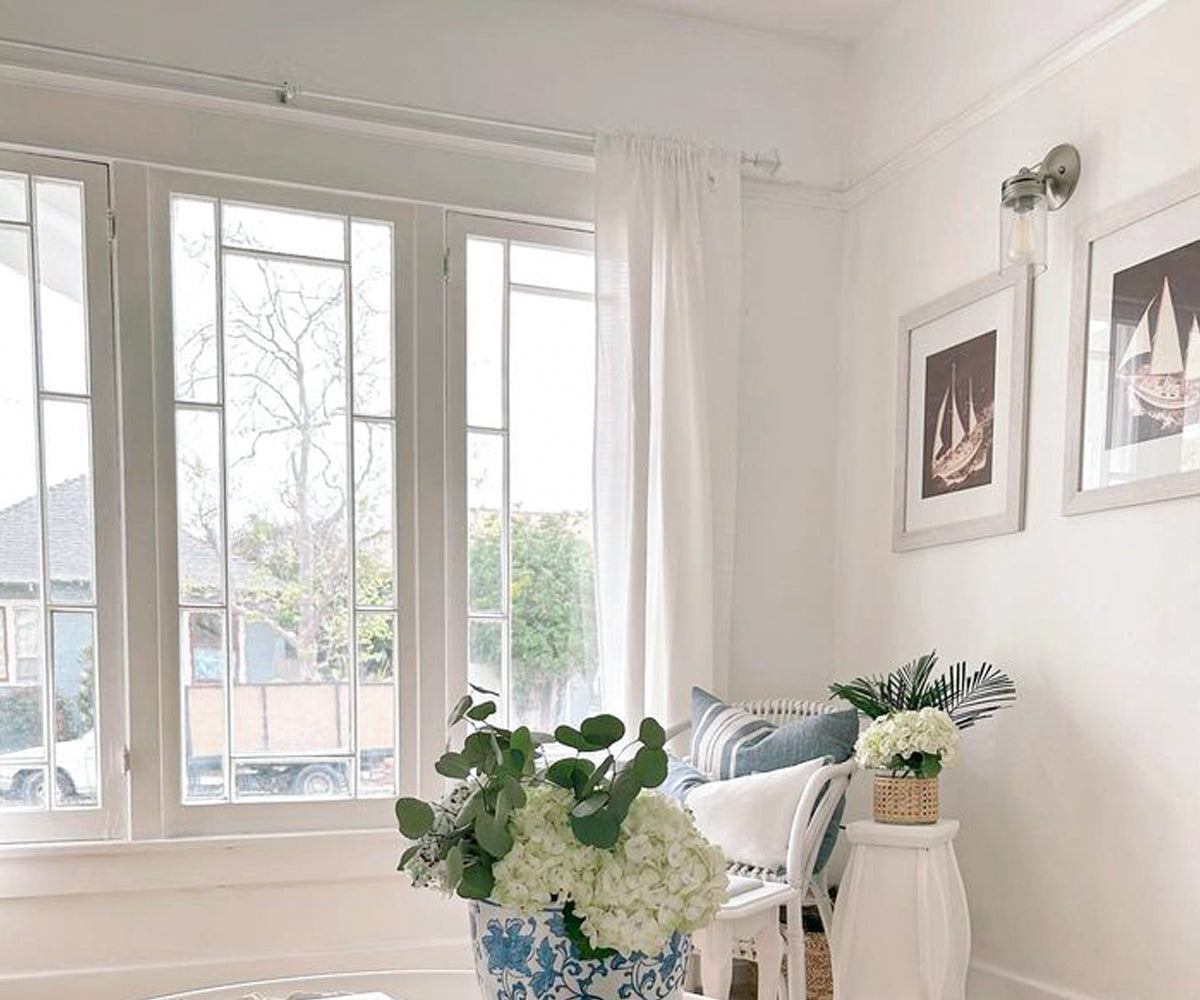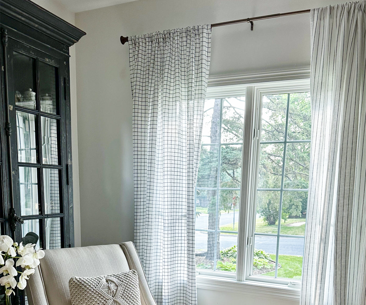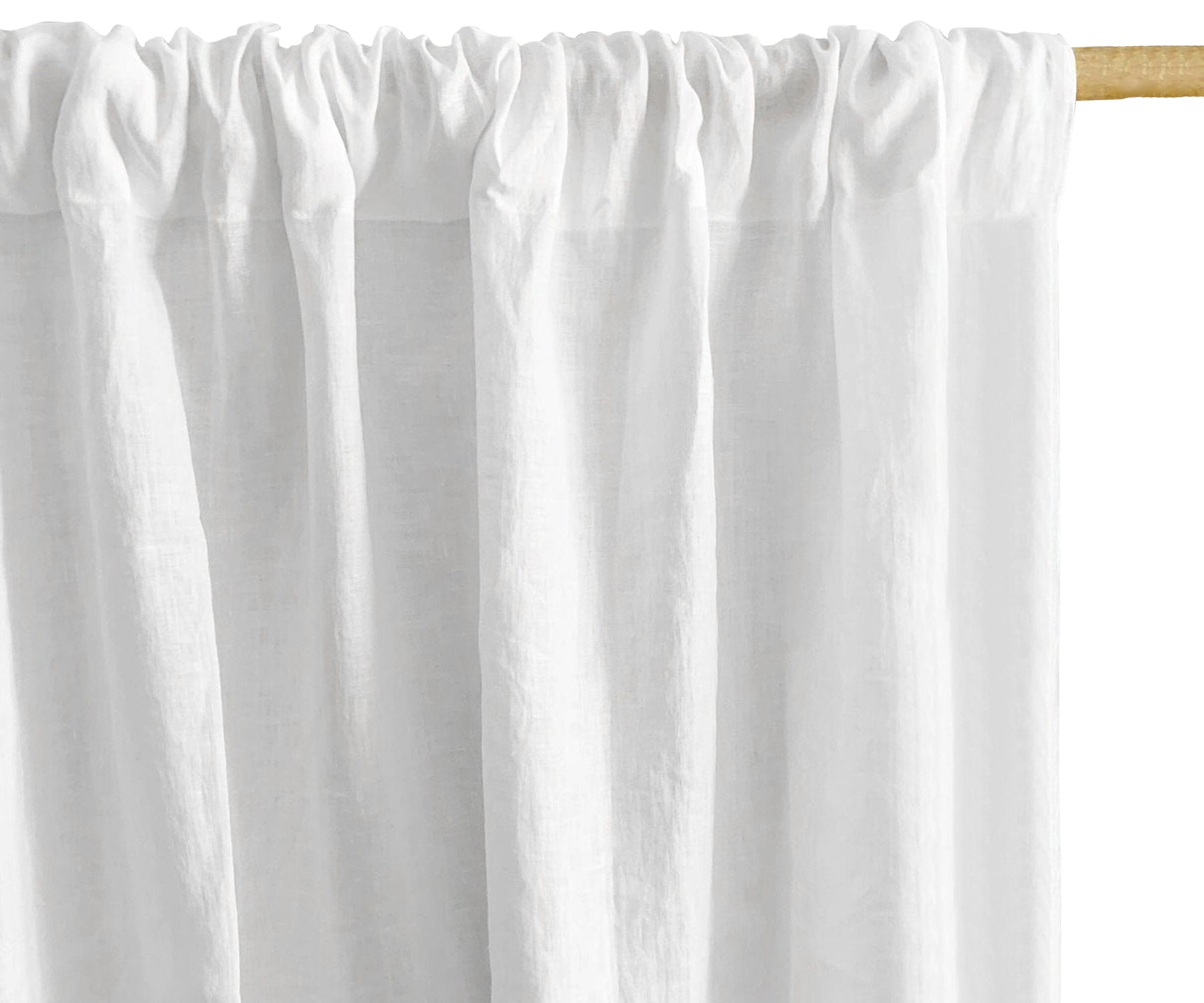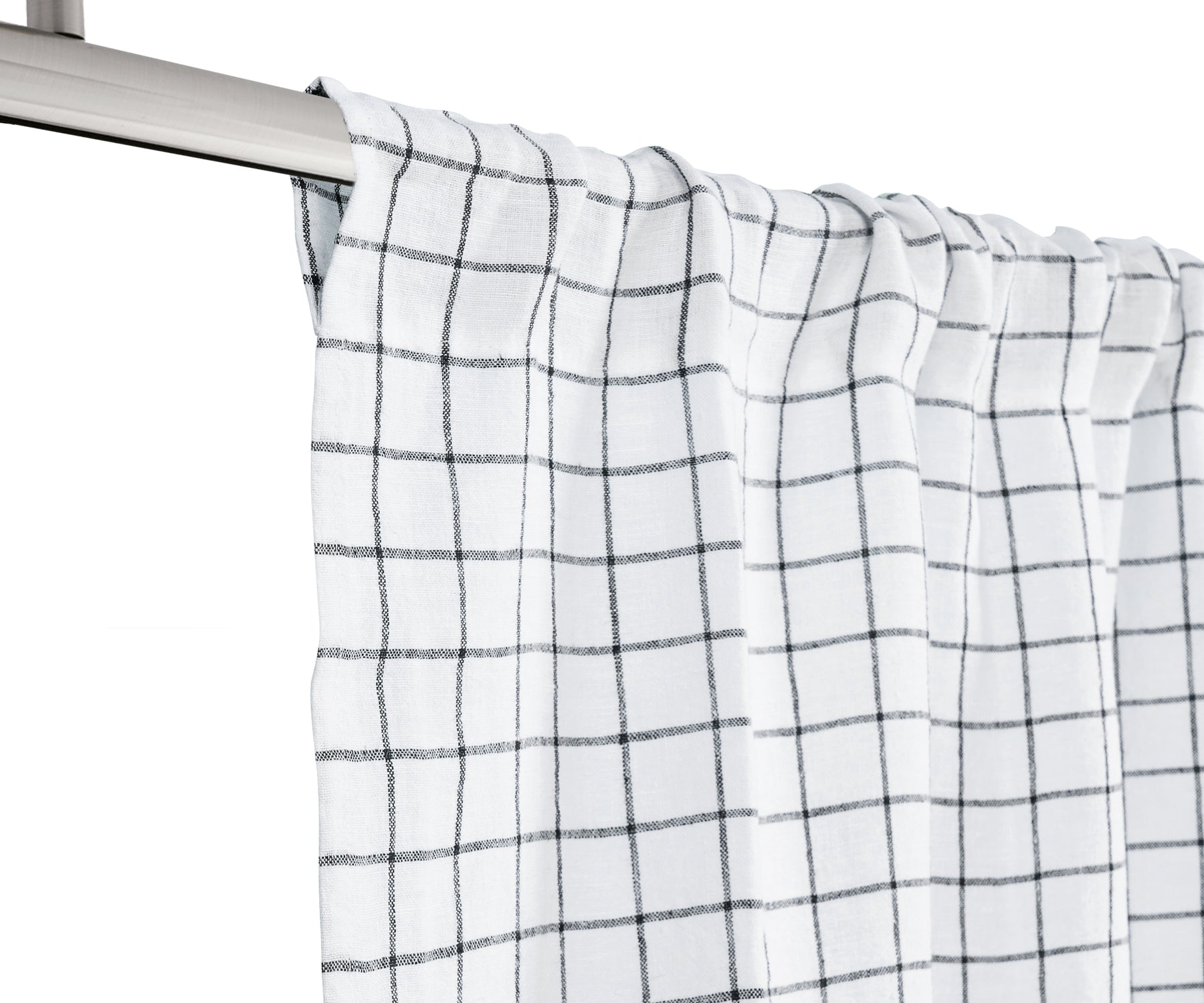



This guide will walk you through a practical, step-by-step system for choosing curtain colors, moving beyond vague theory into actionable rules you can apply today.
How to Choose Curtain Color
Step 1: The Golden Rule – Match, Don’t Match
The most common mistake beginners make is “color matching”, buying curtains that exactly match the wall paint or the sofa. This creates a flat, lifeless look. Instead, follow the golden rule of curtain color: coordinate, don’t match.
Coordination means your curtains belong to the same color family or share an undertone, but with a noticeable difference in depth or saturation. For example:
Don’t: Beige walls + beige curtains.
Do: Beige walls + curtains in a warm cream, a soft taupe, or a deeper sand.
The goal is contrast or harmony, not monotony. Curtains should feel intentional, like they were selected to complement, not blend into oblivion.
Find Out: Holiday Gift Ideas for Every Loved One
Step 2: Start With the Room’s Fixed Elements
Before you dream about colors, audit what you cannot easily change. These “fixed elements” will dictate your curtain’s allowable color range.
The big three fixed elements:
-
Wall color (paint or wallpaper)
-
Flooring (wood tone, tile color, carpet shade)
-
Major upholstery (sofa, sectional, bed frame)
Write down these colors. Then, note their temperature (warm vs. cool). A warm wall has yellow, orange, or red undertones (e.g., Benjamin Moore’s “Manchester Tan”). A cool wall has blue, green, or violet undertones (e.g., “Silver Mist”).
Practical rule: Your curtain color must share the same temperature as your fixed elements. Warm walls need warm curtains; cool walls need cool curtains. Violating this (warm beige walls with cool gray curtains) creates a jarring, clashing effect.
How to Pick Curtain Color When You're Starting From Scratch
If you're furnishing a room from zero, rather than working around existing walls and furniture, the decision-making order flips. Here's how to approach it when there's nothing fixed to build around yet.
Start with the one piece you're most committed to. Whether that's a rug, a headboard, or a piece of art you already own, let that item's dominant or accent color anchor your curtain decision, rather than guessing at wall paint that hasn't been chosen yet.
Pick your wall color second, curtains third. Since walls are the easiest and cheapest element to change later, decide curtain color before committing to paint, then choose a wall shade that complements the curtains rather than the other way around, this gives you more flexibility since curtains are a bigger investment to replace.
Consider the room's natural light exposure first. A north-facing room with limited direct sun handles warm curtain tones (cream, terracotta, warm gold) better, since these counteract the room's cooler natural light. A south-facing room flooded with sun has more flexibility and can carry cooler tones (soft gray, dusty blue) without feeling cold.
Don't skip the "keeper" test. Before finalizing a color for a brand-new space, ask whether you'd still like it in five years. Trend colors (a specific shade of sage, a particular terracotta) shift every few seasons, while curtains, being a larger investment than throw pillows, are worth choosing for longevity over trend alignment.
Step 3: Choose Your Strategy – The 4 Safe Paths
Once you’ve identified your temperature, choose one of these four proven strategies. Ranked from safest to most bold.
Strategy 1: Go Neutral (The Safe Bet – 80% of rooms)
Neutrals work for every room, every style, and every budget. They recede into the background, let other furniture shine, and never go out of fashion. The key is selecting the right neutral.
Warm neutrals: Cream, ivory, oatmeal, taupe, camel, warm greige (gray + beige). Pair with warm walls and wood tones.
Cool neutrals: Pure white (with blue undertones), dove gray, silver, charcoal, true greige. Pair with cool grays, blues, or white walls.
Pro tip: Avoid “builder beige”, that flat, yellow-beige that looks dirty. Instead, choose a neutral with complexity. “Oatmeal” has subtle brown flecks; “Pearl Gray” has a soft sheen.
When to use neutrals: Living rooms, home offices, hallways, any room where you want calm and longevity.
Know About: How to Measure for Curtains the Right Way
Strategy 2: Pull a Minor Accent Color (The Designer Move)
Look around the room for a color that appears in small doses—not the dominant sofa color, but the throw blankets, the vase, the rug’s secondary stripe, or the art print’s highlight.
Curtains in this minor accent color feel sophisticated and intentional. For example:
-
A navy sofa + cream walls + a mustard yellow throw pillow → mustard yellow curtains.
-
A green velvet armchair + white walls + a rug with rust red diamonds → rust red curtains.
Why this works: It expands a small accent into a major statement, creating rhythm as your eye travels from the pillow to the window.
Warning: Only pull from existing accents. Do not introduce a brand-new color at the window unless you are willing to repeat it elsewhere (new pillows, art, or decor).
Strategy 3: One Shade Darker or Lighter (The Monochromatic Trick)
This is the safest way to add depth without introducing a new hue. Take your wall color and shift it one or two steps up or down the lightness scale.
Lighter walls + darker curtains: Crisp white walls + soft charcoal gray curtains. This grounds the room and adds weight.
Darker walls + lighter curtains: Deep navy walls + pale sky blue or white curtains. This prevents the room from feeling like a cave.
How to execute: Bring a paint chip of your wall to the store. Find a curtain that is either two shades lighter on the same strip, or two shades darker. Do not jump to the extreme opposite (e.g., white walls to black curtains) unless you have high ceilings and large windows.
Strategy 4: Bold Contrast (The Pro Move)
For large, well-lit rooms with architectural interest, you can choose a color that actively contrasts with the walls. Think: sage green walls with deep terracotta curtains; pale pink walls with forest green curtains.
This works only when:
-
The room has abundant natural light.
-
You have at least 9-foot ceilings.
-
The contrast color appears at least two other times in the room (rug, art, furniture).
If you are unsure, skip this. Bold contrast done poorly looks like a mistake.
Step 4: The Floor & Trim Factor – The Overlooked Variable
Most guides stop at walls, but your floor and trim (baseboards, crown molding) heavily influence curtain perception.
Dark wood floors (walnut, espresso): These absorb light. Curtains should be medium to light in value to avoid a heavy, somber look. A cream or light gray works better than a dark brown.
Light wood or white tile floors: These reflect light. You have more freedom, but very pale curtains may wash out. Consider a medium-toned neutral or a soft pastel.
White trim: White trim acts as a buffer. It allows you to use almost any curtain color, because the white visually separates the wall from the drape. Dark curtains against white trim look crisp and intentional.
Wood trim (natural or stained): Match the undertone of the wood. Oak (warm, golden) needs warm curtains. Maple (neutral) is flexible. Walnut (cool-brown) can take cool or warm, but avoid reds.
Curtain Colour Selection for Multi-Window Rooms
Choosing one curtain color is straightforward. Choosing colors across a room with multiple windows, especially windows of different sizes or on different walls, adds a layer of complexity worth addressing directly.
Keep every window in a room the same color. Even if windows face different directions or receive different light, using a single consistent curtain color throughout one room creates visual continuity and avoids a disjointed, mismatched feel.
Adjust for window size, not color, when proportions differ. A large picture window and a small adjacent window in the same room should still share the same curtain color; if anything looks off, it's usually a fabric weight or panel-width issue rather than a reason to change color.
Bay windows and connected window groupings should be treated as a single visual unit. Using one continuous color and fabric type across all panels in a bay or corner grouping prevents the eye from reading them as separate, competing elements.
Open-concept spaces need a unifying strategy. In a room that flows into an adjacent living or dining area, using the same curtain color (or at minimum, the same color family) across both spaces keeps the sightline calm, since curtains are visible from multiple angles in open floor plans.
When rooms are visible from one another (a living room curtain visible from the entryway, for example), it's worth choosing colors that don't clash even if the rooms themselves have different wall colors, this is one of the most commonly overlooked details in whole-home color planning.
Step 5: Function Over Fashion – Light & Privacy
Color isn’t just about looks; it’s about behavior. Different colors and linings change how a room feels throughout the day.
Light and color interaction:
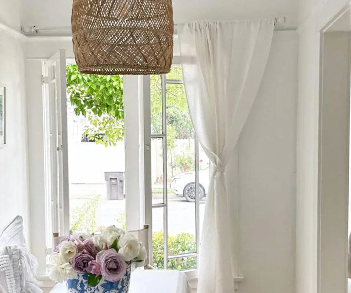
White/cream curtains: Bounce light around, making small, dark rooms feel larger. But they show every smudge and fade faster in direct sun.
Dark curtains (navy, charcoal, chocolate): Absorb light, create a cozy, intimate mood. Excellent for bedrooms and media rooms. They also fade less visibly.
Bright colors (yellow, coral, lime): Cast a colored glow into the room. A bright coral curtain will make a white room look pinkish at noon. Test a swatch first.
The lining shortcut: For bedrooms, regardless of curtain color, insist on blackout lining (a white or cream backing). This blocks 99% of light and insulates the room. For living rooms, thermal or lined curtains (still in your chosen color) reduce noise and drafts.
Practical rule: Hold your curtain fabric sample against the window at three times of day: morning (cool light), noon (harsh light), and evening (warm artificial light). The color will look different in each. Only buy if you like it in all three.
Step 6: The Pattern Question – When to Introduce Prints
Solid colors are safer and more versatile. But patterns (stripes, florals, geometrics) add personality. The rule is simple: patterned curtains work best in low-clutter rooms.
Use patterns when:
-
Your walls are a solid, neutral color.
-
Your furniture is solid and simple.
-
The pattern includes at least one color already in the room.
Avoid patterns when:
-
Your room already has patterned wallpaper, a busy rug, and patterned throw pillows (sensory overload).
-
The window is small (pattern gets lost or looks frantic).
-
You plan to move the curtains to another room later (solids are reusable).
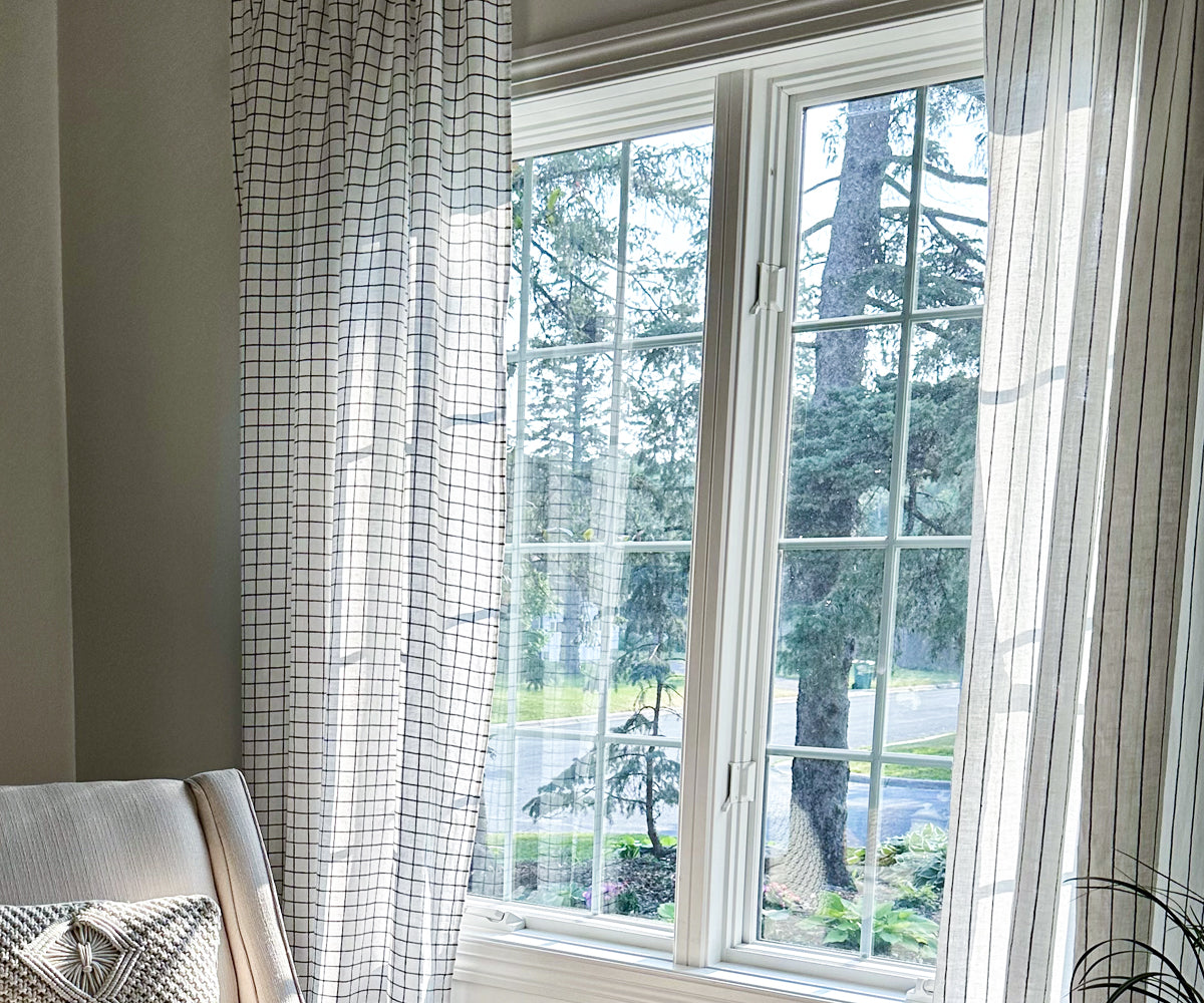
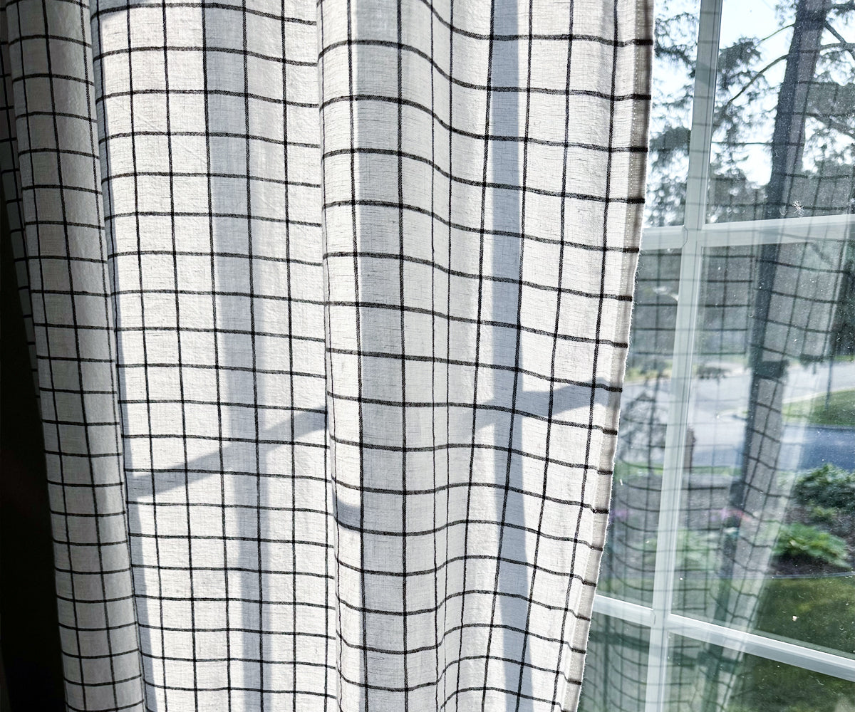
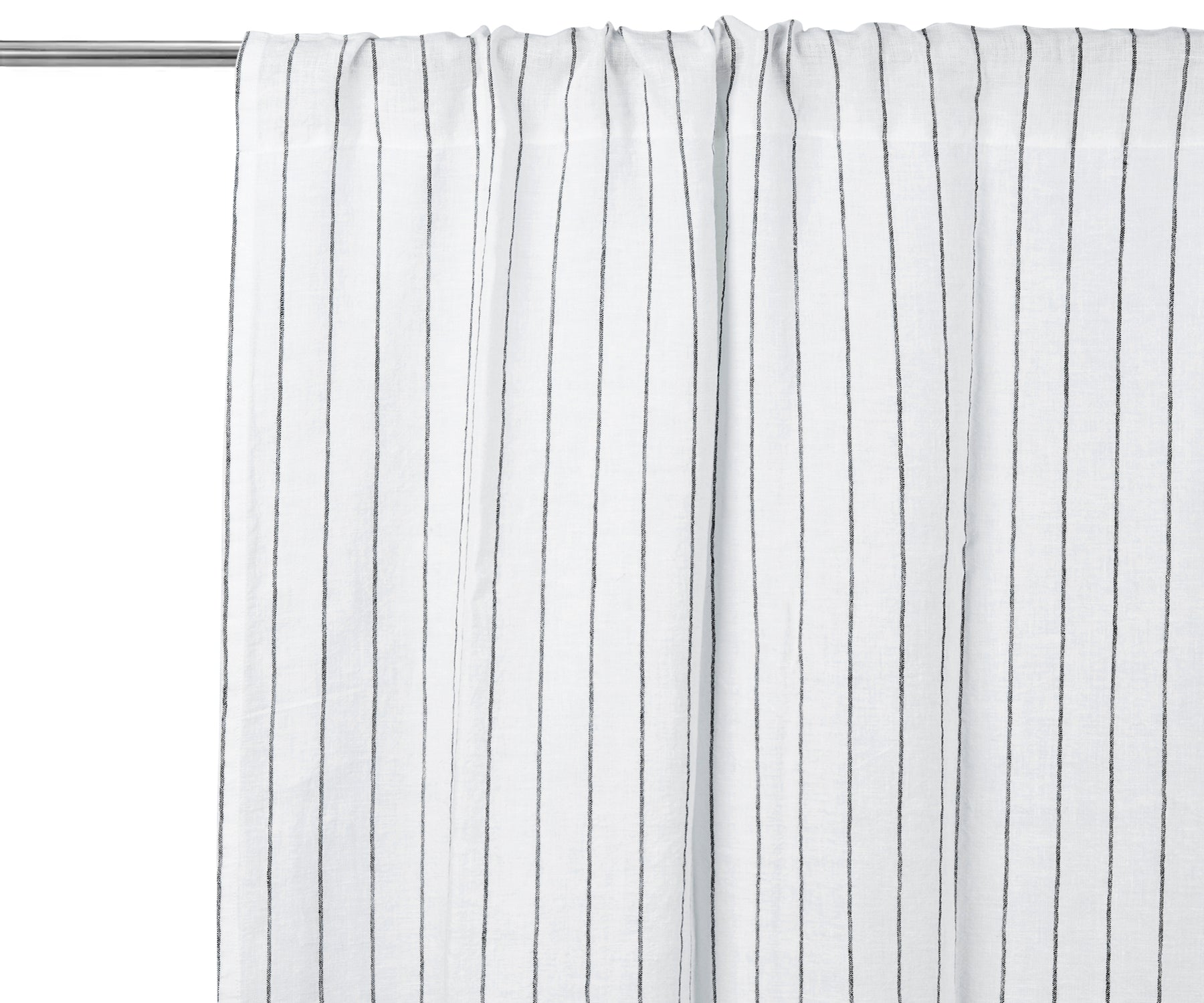
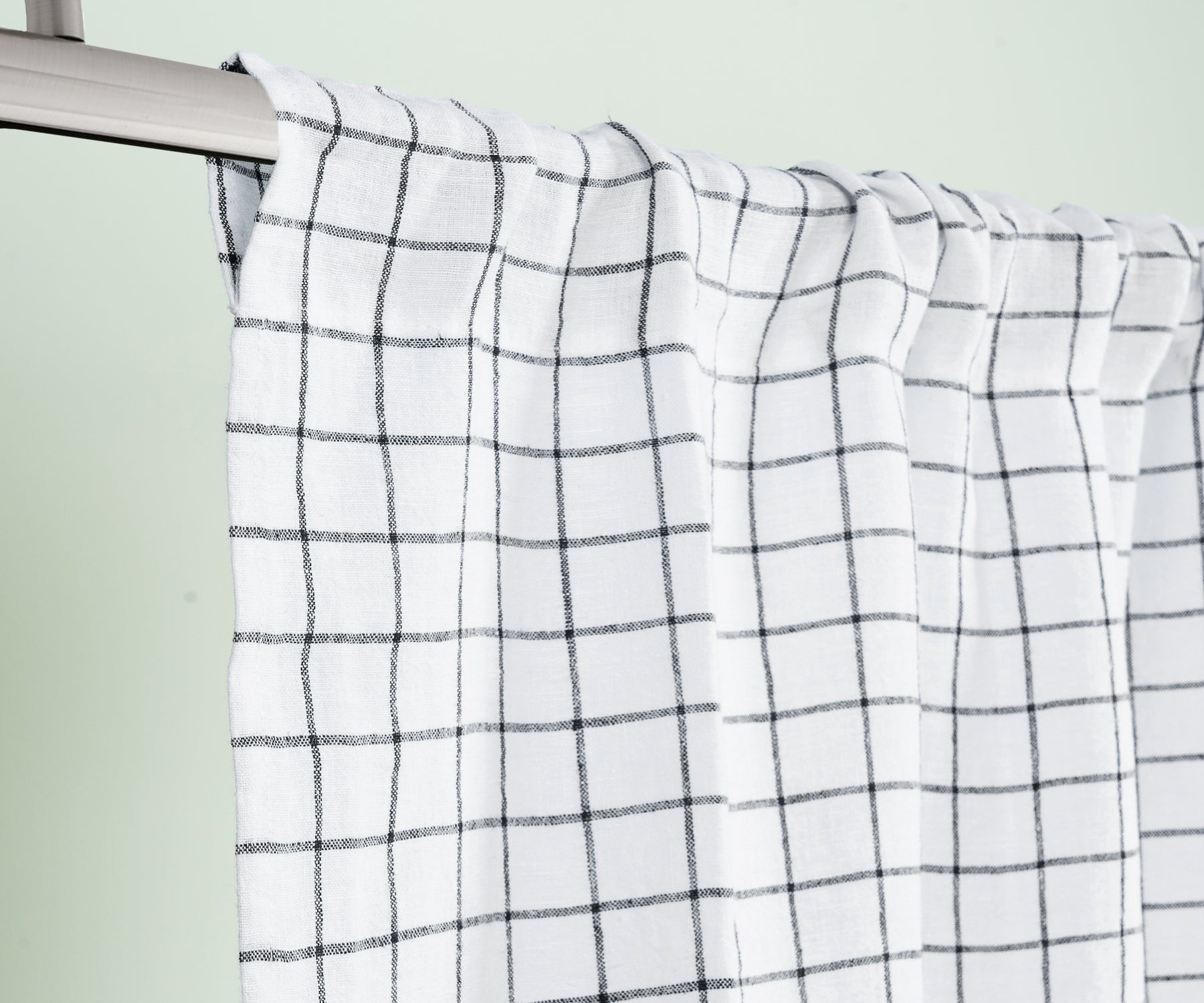
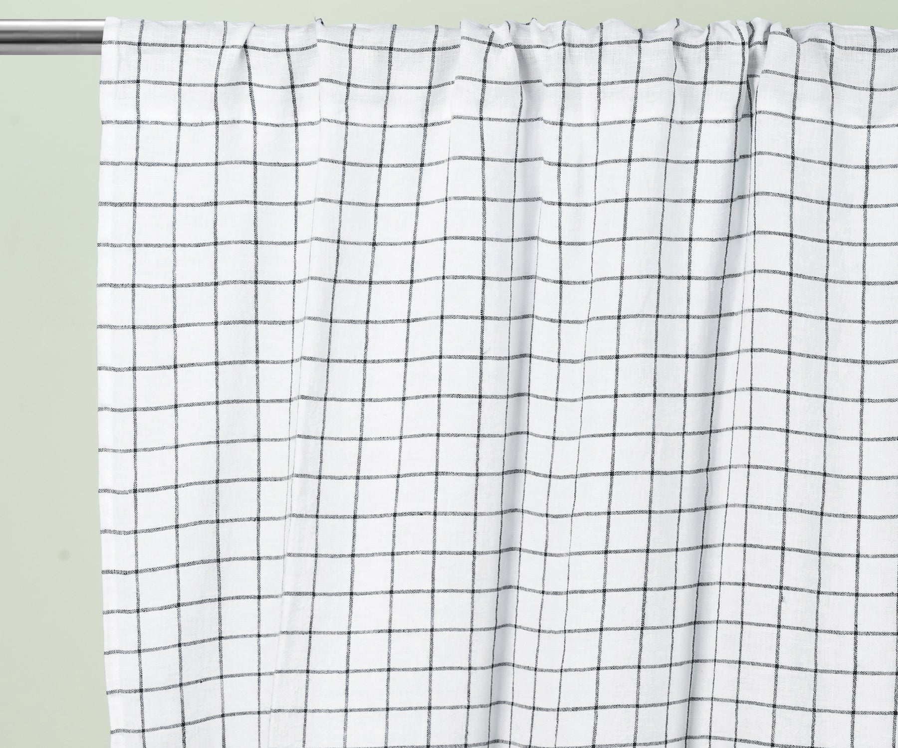
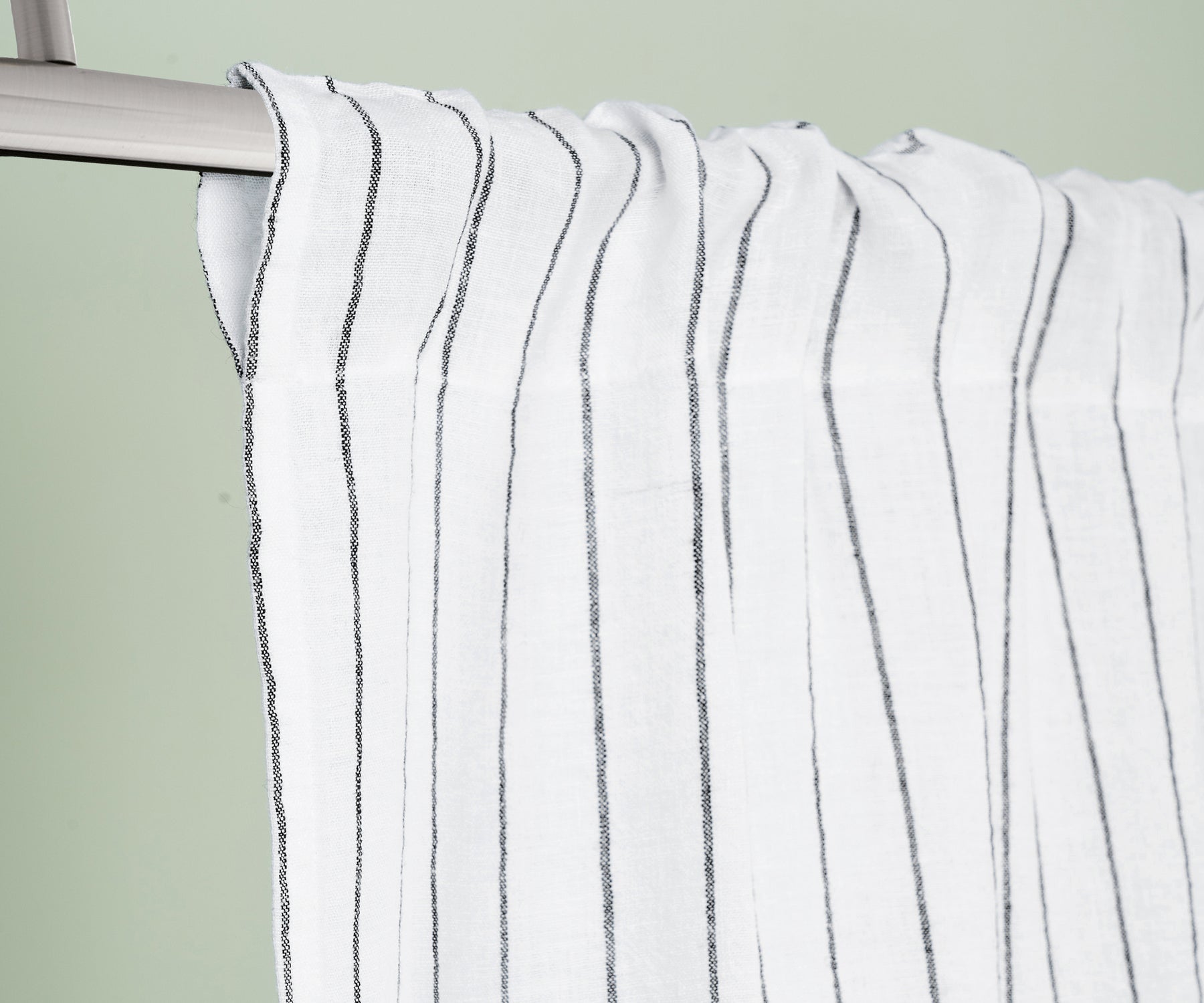
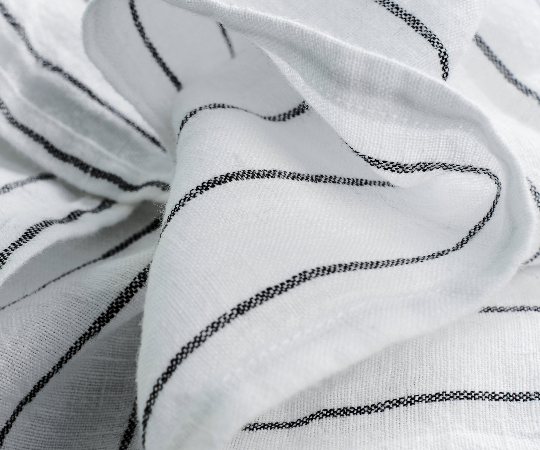
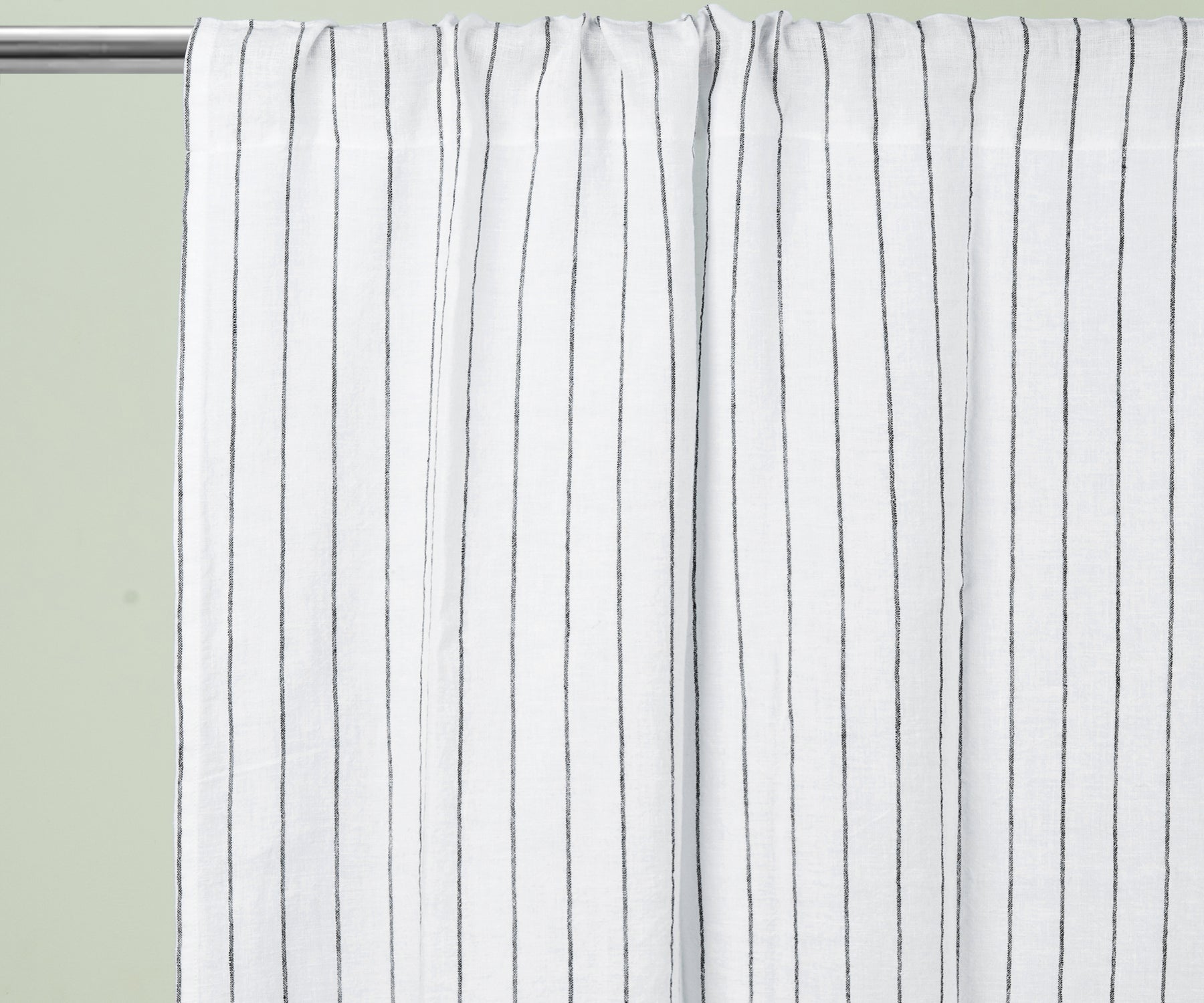
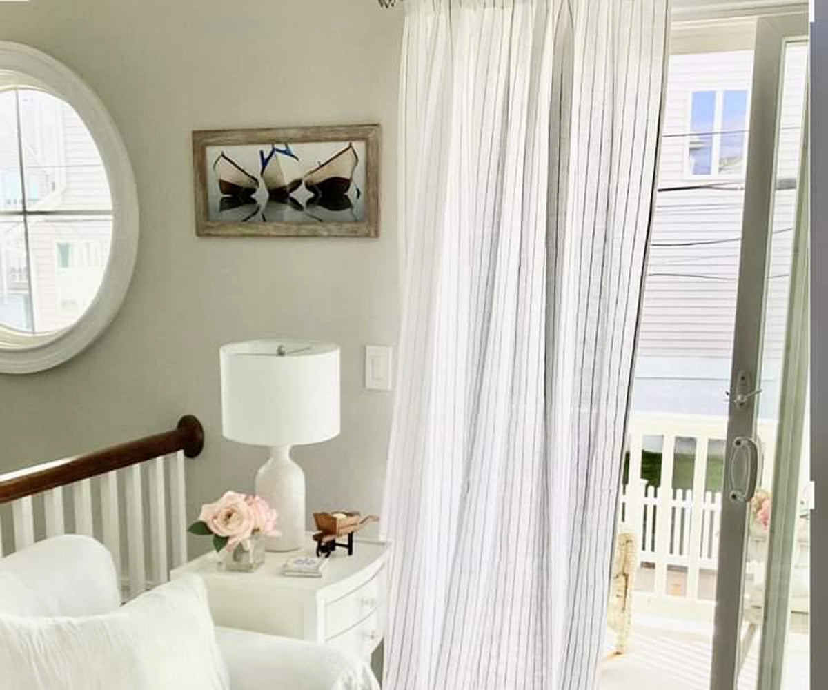
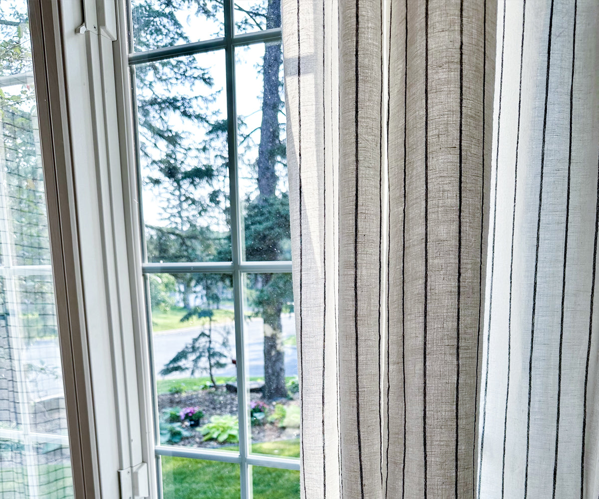
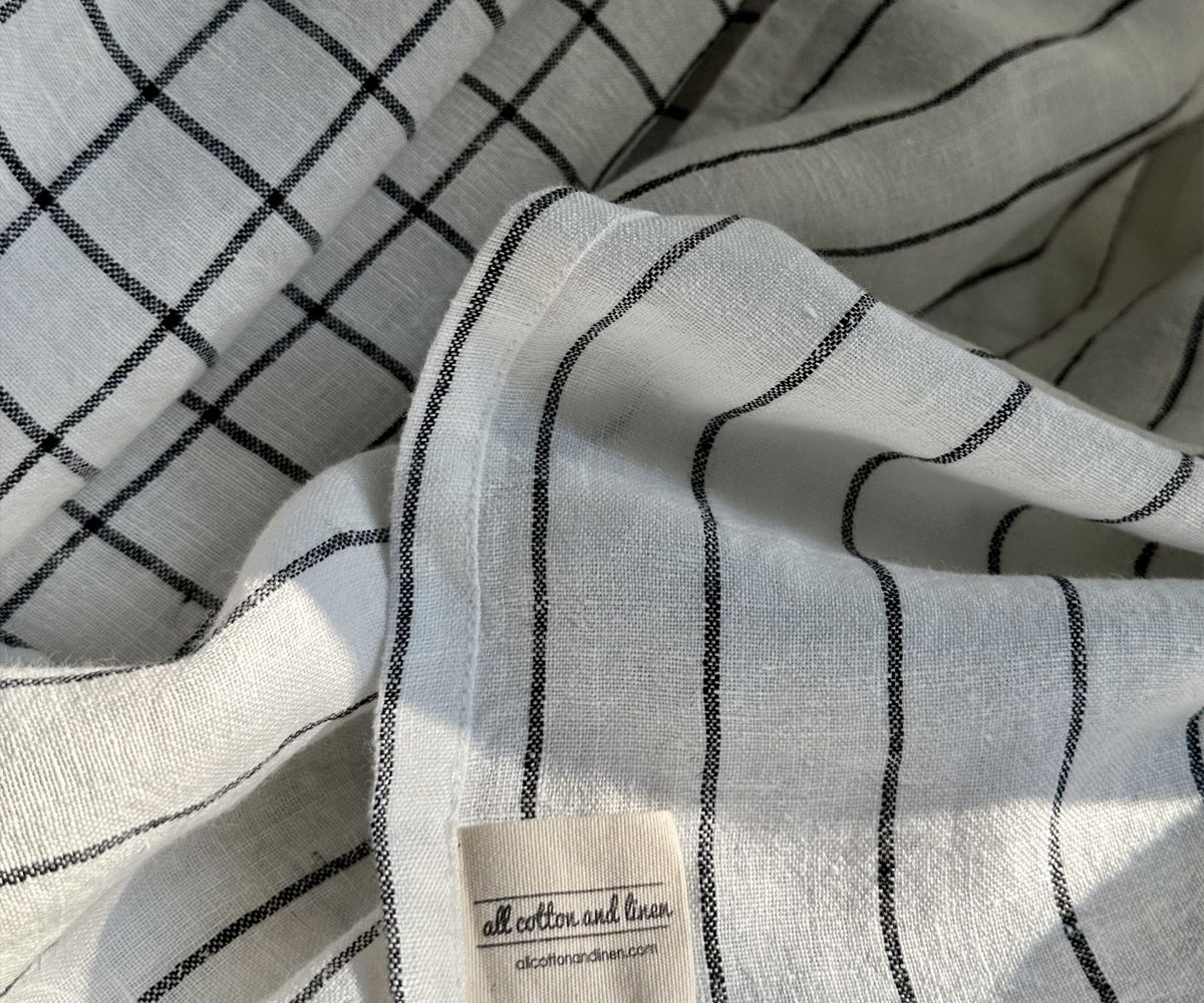
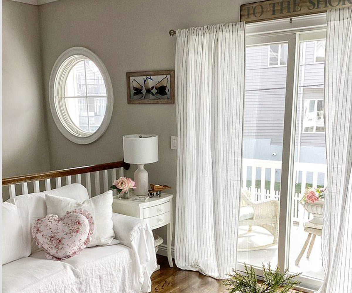
If you choose a pattern, make the background of the pattern match your wall color, and let the foreground be an accent. For example: cream walls + cream curtains with thin navy stripes.
Step 7: The Final Test – The “Three-Foot” Rule
You’ve narrowed it down to 2-3 options. Now, test them properly. Never decide from a 2-inch swatch.
The professional method:
-
Buy or borrow a 12”x12” sample (many companies offer this).
-
Pin it to your existing curtain rod or hold it against the window.
-
Step back three feet. Do not inspect it up close.
Ask three questions:
-
Does it recede or shout? (Curtains should support, not scream.)
-
Does it make the room feel calmer or more chaotic?
-
Does it look good with the floor and trim?
If you hesitate on any answer, eliminate that color. The right color will feel obvious from three feet away.
Real-World Room-by-Room Cheat Sheet
Living room: Neutral (oatmeal, light gray) or a minor accent (dusty blue, sage). Prioritize softness and airflow.
Bedroom: One shade darker than walls (for depth) or a deep, restful tone (navy, charcoal, forest green). Add blackout lining.
Kitchen: Light, washable neutrals (white, cream) or a cheerful bright (yellow, mint) to match small appliances.
Home office: Cool, focus-enhancing colors (pale blue, soft green, dove gray). Avoid stimulating reds or oranges.
Kids’ room: A color from their bedding or rug. Darker curtains hide stains better than pastels.
Three Mistakes to Avoid at All Costs
-
Buying curtains before wall art. Art introduces new colors. Choose your largest art piece first, then pull a curtain color from it.
-
Ignoring the return. Curtains should extend past the window frame. Color on the outer edges matters just as much as the center.
-
Forgetting about sheen. Matte curtains hide wrinkles; satin/silk reflect light but show every fold. In a casual room, choose matte.
Overview
Choosing curtain color is not about finding the “perfect” hue, it’s about eliminating bad options. Start with your fixed elements (walls, floors, sofa). Decide on a temperature (warm or cool). Then pick a strategy: neutral, minor accent, monochromatic shift, or bold contrast. Test a large sample at three times of day. And always remember: curtains are background players, not lead actors. When they’re right, you won’t notice them. You’ll just feel that the room works.