





How to Choose the Right Table Linen Color for Your Home?
Choosing the table linens is a great opportunity to transform the look and feel of your dining room. Whether you are decorating your dining table for everyday use, for the holiday season or to create an elegant table setting for a special event, the colors of your table linen will bring it all together.
From neutral colors, white tones, greens, browns, seasonal colors, and more, there is a wide variety of colors to choose from. But how to know which color to choose?
The trick is to know how to match the colors to your décor, the occasion, the desired mood, and the color combinations. This guide will show you how to choose the table linen colors for your tablecloths, napkins, table runners, and other table linens.
Why Does Table Linen Color Matter?
Table linens are more than just functional pieces; they can be an essential part of your décor and set the tone for your entire dining room.
A simple white cloth can give a sense of elegance to a table, while earthy tones create a cozy farmhouse feel. Dark shades speak loudly, while light pastels refresh and invite guests to have a seat.
Moreover, the right colors can
-
Make your dining room decorator friendly
-
Draw attention to your dinnerware and centerpieces
-
Set the mood,
-
Give a meal a more welcoming feel,
-
Help coordinate your holiday decorations,
-
Even update your dining room's look year after year.
Instead of picking a color based only on personal preference, consider how the cloth will look against the other objects on your table.
Consider Your Home's Existing Color Palette
The easiest place to start is by looking at the colors you already have in your dining room.
Consider such attributes as:
-
The walls,
-
Dining chairs,
-
Curtains,
-
Rugs,
-
Furniture,
-
Dishes,
-
Decorative accessories.
If you have plenty of colors in your dining room, go for neutral tones in table linens. In this case, white, cream, beige, or natural linen colors would be a good choice.
However, if you have neutral colors in your dining room, choose colorful tablecloths, runners, and napkins to add interest to the room. For example, a cream-colored dining room would look adorable in olive green or brown table linens, whereas a dining room with dark furniture would need light beige or ivory linens on the table to look good.
Explore Different Table Linen Colors
Explaining how colors influence the appearance of the table will help someone pick them easier.
White
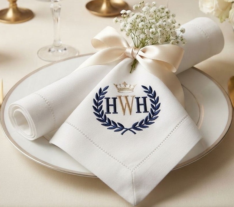
Out of all the table linen colors, white is the most classic and time-resistant option. It makes the table look neat and upscale, being suitable for both everyday use and special occasions.
White tablecloths are great when one wants to make the centerpiece, dinnerware, or flowers the center of attention.
Suggested Product: White tablecloth

Cream and Beige
Cream and beige colors imitate the cosiness of neutral shades, while being less austere than white.
These hues are great for farmhouse, rustic, Scandinavian, and minimalist styles. The beige linens add texture to the table while remaining casual.
Suggested Product: Natural tablecloth

Green
Green is a color that invigorates and brings the outdoors in. Subtle shades of sage and olive look wonderful against wood grain and other natural surfaces.
A nature-inspired tablescape using green linens and wooden boards.

Blue
Blue table linens create a casual but sophisticated backdrop for any meal. Shades of light blue add a refreshing color to any dining room, while deeper shades of blue add drama and elegance to the dining table.
Use blue table linens to create exciting combinations with white tableware and accessories in silver or other neutral metals.

Yellow and Mustard
Warm yellows and mustard in tones are perfect for making your dining table bright and inviting. Especially when you want to create a cozy autumn-themed table setting for an informal gathering.
To go with mustard, try using creams, beiges, browns, and wood tones.

Brown
Brown and warm earthy tones are great for dining rooms that use a rustic or farmhouse style because the color complements the natural wood of the furniture.
To bring all of the elements together, try using browns and creams, linens, ceramics, and place some plants on the table.

Burnt orange color palette
Burnt orange is a warm color that adds interest to your table without being overpowering. It's perfect for fall entertaining and Thanksgiving decorating.
Pair it with beige, cream, brown, or pale green.

How to Create Beautiful Tablecloth Color Combinations?
Choosing one color to work with is easy enough. Choosing a combo that all works well together is a bit harder.
The trick is to not use too many clashing colors, pick one main color to go with, and then maybe one or two other colors to go along with it.
Here are some easy tablecloth color combinations to try:
|
Tablecloth Color |
Complementary Colors |
Style |
|
White |
Green, gold, beige |
Elegant and fresh |
|
Cream |
Brown, olive, terracotta |
Rustic and cozy |
|
Beige |
White, sage, brown |
Natural and relaxed |
|
Olive Green |
Cream, beige, and wood tones |
Earthy and sophisticated |
|
Navy Blue |
White, cream, silver |
Classic and elegant |
|
Mustard |
Beige, brown, cream |
Warm and inviting |
|
Burnt Orange |
Cream, brown, olive |
Autumn-inspired |
|
Deep Red |
Cream, gold, green |
Festive and dramatic |
Another popular way to decorate a table is to use the 60-30-10 rule. The idea is to use one color that takes up 60%, the second one that covers 30%, and the third one as an accent that comprises 10% of the whole setting.
For instance, you can use cream-colored table linens, olive napkins, and wood/gold décor to achieve such a combination.
Match the Table Linen to Your Dining Style
Your home’s decorating style should also play an important role in your choice.
Farmhouse Style
For a farmhouse table, go with natural earth tones such as
-
cream,
-
beige,
-
brown,
-
sage green,
-
muted blue.
Linen or cotton tablecloths, along with wooden accessories and simple ceramic dinnerware, are a great combination to achieve the desired look.
Modern Style
Modern dining rooms are best decorated in simple colors.
Using white, charcoal, beige, black, or dull green paints can make the table look elegant, but not overdone.
Traditional Style
Traditional dining rooms can be furnished in white, ivory, navy, burgundy, or green.
Choose your table linens with small patterns or intricate details if you want to make the room look more interesting.
Rustic Style
The rustic decoration is perfect with warm and natural colors such as wood, beige, cream, terracotta, olive, and ochre. Moreover, using the fabric made from linen or cotton can add comfort and coziness to the table composition.
Think About the Occasion
The best color of your table linen is not always the same. You can have different table linen colors for your everyday use, for seasonal decorating, and for the holiday season.
- For everyday use, it is better to choose neutral colors such as cream, beige, white, and linen.
- For seasonal decorating, you can go for green and other pastel shades for spring and summer seasons and choose orange, brown, mustard, and dark red colors for autumn.
- For the holiday season, you can either stick to traditional colors or try something new to create a contemporary look.
What Color Tablecloths for a Wedding?
If you are wondering what color tablecloths to use for a wedding, make sure to start with the wedding’s overall color scheme and venue. After that, pick out the perfect hues for your table linen. As for the color options, white and ivory variations are always a safe bet, as they will set the tone for the whole event. Nevertheless, you can go for something more vibrant like champagne, blush, sage green, dusty blue, taupe, or jewel tones.
For an elegant wedding, consider:
Ivory + Champagne + Gold
This combination will give the wedding a soft and luxurious look.
For a garden wedding, consider:
Sage Green + Cream + Natural Beige
This combination will look especially nice among the flowers.
For a romantic wedding, consider:
Blush + Ivory + Soft Green
This combination will create a lovely and warm atmosphere for the wedding.
For a modern wedding, consider:
White + Charcoal + Metallic Accents
This combination creates a clean and contemporary appearance.
Remember that the tablecloth does not have to coordinate all items since in some cases it will allow the centerpiece and place settings to stand out more.
Don't Forget the Napkins and Table Runner
Your tablecloth in beige is only one element of the color scheme.
Napkins and table runners allow you to add another color to the composition without making it look cluttered.
For instance, if your tablecloth is beige, you could use the following color scheme:
-
Olive green napkins
-
Burnt orange table runner
-
Brown placemats
-
Cream dinnerware
If your tablecloth is white, you can be even more adventurous with the color scheme since you will be able to choose accent colors for your napkins, table runners, flowers, and dinnerware. You could also add a table runner in a contrasting color to give the composition a centerline focus.
Match Colors With Your Dinnerware
Your dinnerware can be either complementary or contrasting to your table linens.
White plates are suitable for almost all table linens, whereas patterned or brightly colored plates would go well with the more unobtrusive tablecloths.
For example, plates with flowers on them in different colors would look nice on a table with a cream or natural linen tablecloth, but something simple like white plates could be an attractive addition to a table with navy-blue, green, or brown tablecloths.
So that your whole table does not turn into a single entity but remains diverse, it has to be composed so that some elements complement each other, but others remain contrasting.
Use Seasonal Colors to Refresh Your Table
Changing your table linens is one of the simplest ways to refresh your dining room throughout the year.
Spring
-
Soft green
-
Pastel blue
-
Blush
-
Cream
-
Light yellow

Summer
-
White
-
Light blue
-
Natural beige
-
Soft green
-
Fresh yellow

Fall
-
Burnt orange
-
Mustard
-
Warm browns
-
Deep reds
-
Olive greens

Winter
-
Deep greens
-
Burgundy
-
Ivory
-
Navy
-
Warmer neutrals

You don't have to freshen up the whole dining room for each season; throw on a new tablecloth or runner and you're good to go.
Choose Colors Based on the Mood You Want
Color has a huge impact on the atmosphere of a room.
So, if you want to create a certain mood in your dining room, consider the following color schemes.
If you want to create a calm and peaceful atmosphere, go with soft neutrals, sage, light blue, or cream.
To set a warm and cozy mood, use brown, mustard, terracotta, burnt orange, or deep red.
If you want your dining room to be elegant, opt for white, ivory, navy, charcoal, or champagne.
To make your room seem fresh and natural, combine beige, cream, olive, and green.
Remember that thinking about the mood you want to set in your dining room will make it easier to choose colors.
Don't Be Afraid to Mix Textures
A table’s appearance relies not only on the color of the textiles used but also on the texture. A neutral color palette can be further emphasized with the help of different textures in order to achieve the desired look.
For instance, using a linen tablecloth in combination with cotton napkins, woven placemats, wood, and ceramic dinnerware will give good results. Even though some elements are neutral in color, the variety of textures helps to avoid monotony.
The same principle can be applied when using neutral table linen colors in order to achieve a more exciting look. If one opts for the use of neutral colors, then different textures will help to liven up the decor.
Overview
When choosing table linen color, make sure not to complicate the process by trying to find the perfect match. First, assess the colors in the room, your decorating style, the occasion, and the mood you want to create. Neutral colors such as white, cream, and beige are always a safe bet, while green, blue, mustard, burnt orange, and deep red add vibrancy and warmth.
Another important thing to consider when buying table linens is the ability to mix and match different colors. You should also layer the tablecloth with runners and napkins and play with the dinnerware and centerpieces.
Therefore, regardless of whether you are going for a casual farmhouse look or a more upscale wedding tablescape, the right table linens will transform your dining table into something extraordinary.

3 comments
ACL Staff
@BridalJourney
If you want a dining room theme that mixes modern and Victorian elements, pick table linens that blend these styles. Choose bold, contrasting colors and patterns that stand out but also have something in common, like a similar color or design element, to keep the look cohesive.
@BridalJourney
If you want a dining room theme that mixes modern and Victorian elements, pick table linens that blend these styles. Choose bold, contrasting colors and patterns that stand out but also have something in common, like a similar color or design element, to keep the look cohesive.
BridalJourney
What if you want to create a dining room theme that purposely clashes with traditional design principles, such as mixing modern and Victorian elements? How can you choose table linens that add to this intentionally eclectic and unconventional look while still maintaining a sense of cohesion in the space?
What if you want to create a dining room theme that purposely clashes with traditional design principles, such as mixing modern and Victorian elements? How can you choose table linens that add to this intentionally eclectic and unconventional look while still maintaining a sense of cohesion in the space?
Kayla
Thanks for sharing informative article
Thanks for sharing informative article