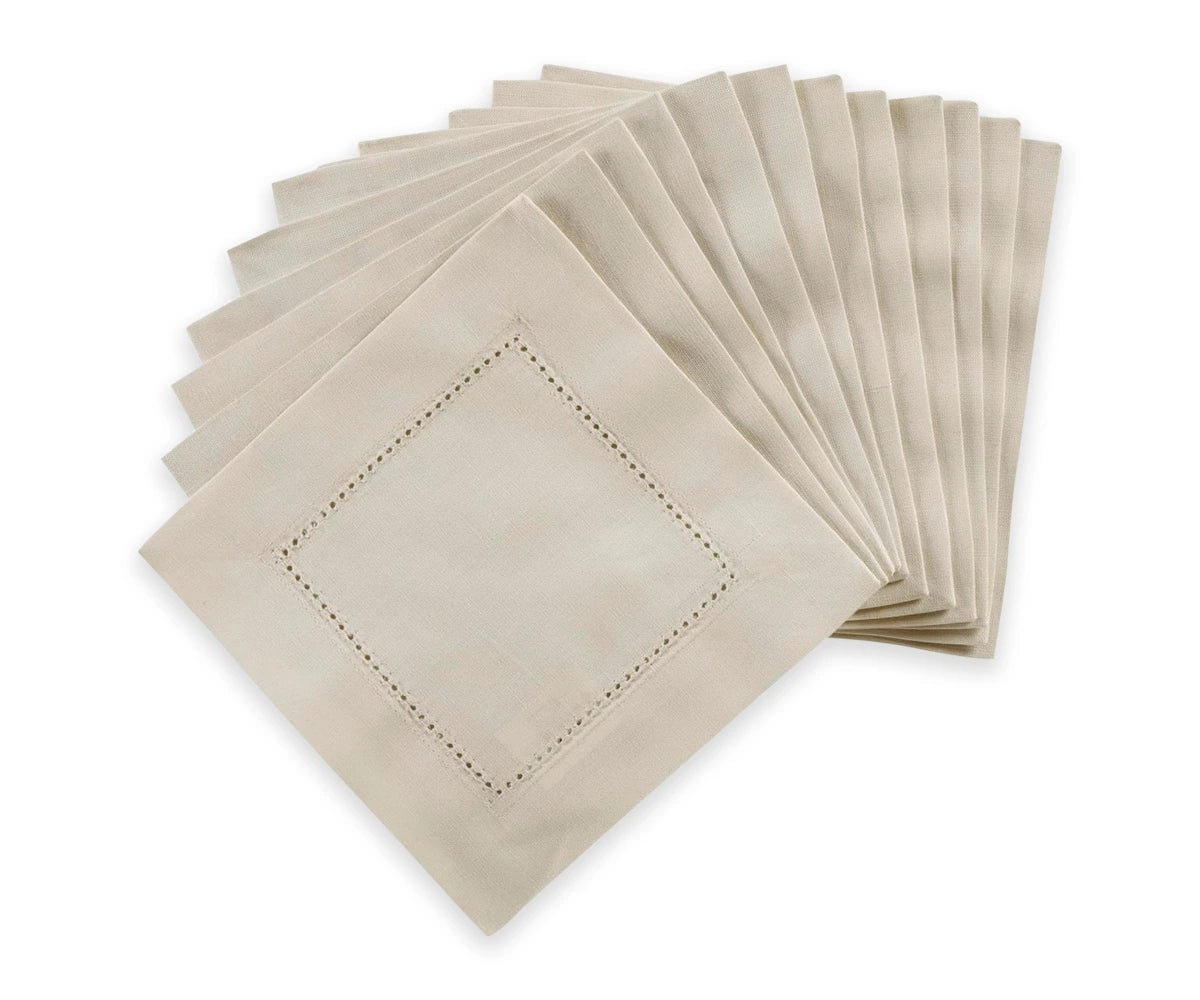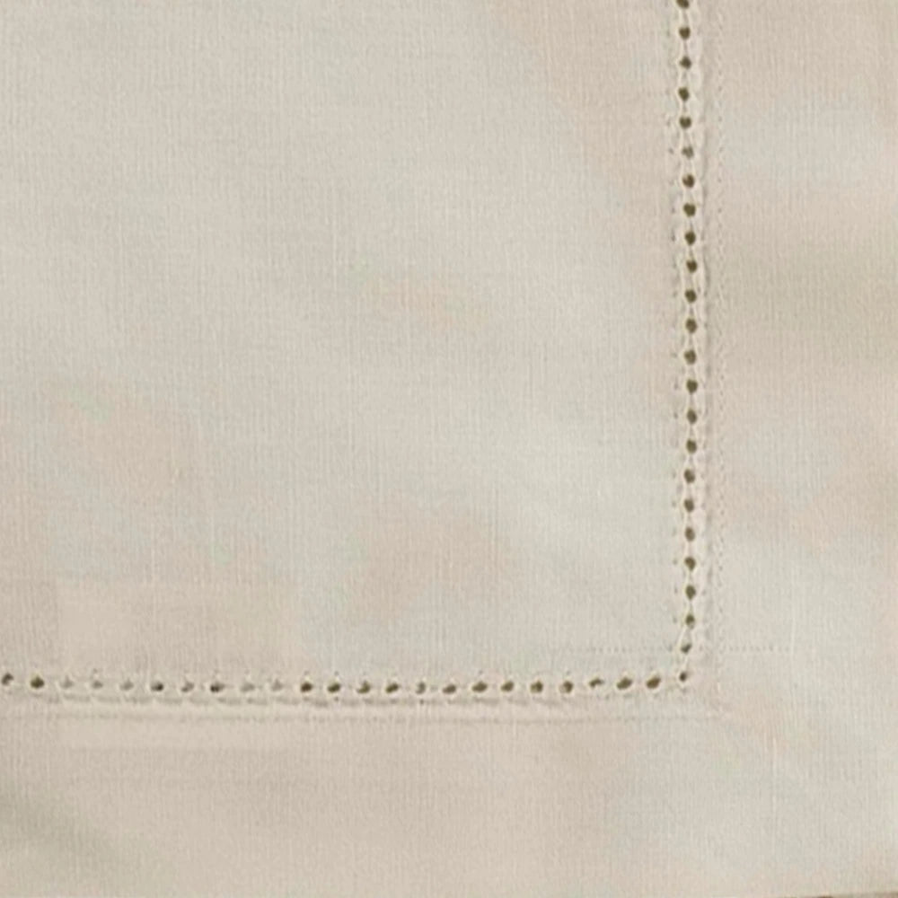



Beige has long been associated with calm, quiet interiors, but warm neutrals do not have to be predictable. When paired with a bold accent color, beige linens can become the foundation for a much more expressive look. The contrast works because the neutral background provides visual balance while the brighter shade introduces energy and personality.
This approach is especially effective with bedding, table linens, curtains, and cushions. Rather than replacing an entire room's color scheme, homeowners can keep the larger textile pieces warm and understated while using one or two stronger colors to create visual interest.
The idea behind “neon beige” is not to make beige itself bright. Instead, it describes a styling approach in which warm beige provides the backdrop for unexpectedly vivid accents - a look that can feel modern without becoming visually overwhelming.
Why Warm Beige Works as a Neutral Foundation
Not all beige tones look the same. Some have yellow or golden undertones, while others lean toward gray, pink, or cream. For a warm-neutral scheme, shades with subtle yellow, tan, sand, caramel, or oatmeal undertones generally create a softer foundation.
Natural fabrics can strengthen this effect. Linen, cotton tablecloth, and other woven blends often introduce small variations in color that keep beige from looking flat. These subtle differences can make a room feel layered even when the overall palette remains restrained.
Warm beige also pairs well with natural materials such as wood, rattan, stone, and brushed metal, none of which require a strong accent color to feel complete. This gives the room a stable visual foundation before any brighter tones are introduced.
Lighting matters too. Warm artificial light can make beige appear richer and more golden, while cool daylight may reveal more neutral or gray undertones. Testing fabric samples in the actual room is more reliable than choosing a color from an online image alone.
Select a Bold Accent That Complements the Undertone
Once the main beige has been chosen, the next step is selecting the accent color. The strongest results usually come from colors that create clear contrast without fighting the warmth of the neutral.
Terracotta, cobalt blue, emerald green, deep red, vivid orange, and bright pink can each create a different mood. The right choice depends on the atmosphere you want to establish in the room.
A warm beige paired with orange or coral can create an energetic, autumn-inspired look. Blue introduces cooler contrast, while green reinforces the natural qualities of linen and other organic textiles. A strong magenta or pink accent can make the neutral foundation feel more contemporary.
Timing also plays a role in how homeowners approach these refreshes, since many people update linens seasonally rather than all at once. Late summer is a common point for this kind of swap, and it overlaps with other household concerns that have nothing to do with color. For instance, homeowners researching household upkeep this time of year may come across information on august pest problems in Alabama, since insect activity tends to rise with the heat and humidity typical of the season. Pest behavior depends on weather, moisture, and the layout of an individual property, so these seasonal patterns are useful general guidance rather than a certainty for any specific home.
Build Contrast Through Layers of Texture
Color is only one part of the equation. Texture can make a warm-neutral room feel far more sophisticated, particularly when most of the larger textiles share similar tones.
A smooth beige cotton sheet can be paired with a loosely woven linen blanket, a quilted coverlet, or a textured throw. Each material reflects light differently, creating visual variation even when the colors remain closely related.
This matters most when the accent color appears only in small areas. A bright cushion or throw becomes more noticeable when it is surrounded by varied beige textures rather than a single flat shade.
Picture a bedroom with oatmeal-colored linen bedding, a woven cream blanket, and one vivid cobalt cushion. The neutral textiles establish continuity, while the blue accent becomes the natural focal point of the room.
Seasonal Swaps and the Realities of Late-Summer Upkeep
Because many households refresh their linens as the seasons change, late summer is often when beige bedding and table textiles get swapped out or stored away. This is also a season when general home maintenance tends to increase, partly due to heat and humidity affecting fabric care.
Before storing seasonal linens, it helps to wash and fully dry them according to their care labels, then fold them in a clean, dry area rather than a damp closet or basement. Homes in warmer, more humid climates should pay closer attention to this step, since moisture trapped in fabric can lead to odors and, in some cases, attract pests looking for shelter or food residue. This is part of why articles covering august pest problems in Alabama often mention indoor humidity and food debris alongside outdoor insect activity - the two issues can be connected in a household, even though one is about decor and the other about maintenance.
None of this changes the styling decisions themselves, but it is a practical reminder that seasonal textile changes and general home upkeep tend to happen around the same time of year.
Use the Accent Color Strategically
A bold color does not need to appear everywhere to have an impact. Repeating it too frequently can actually reduce the contrast that makes the accent effective in the first place.
One approach is to select a primary accent and repeat it in two or three locations. A vivid orange, for example, might appear in a cushion, a small throw, and a single piece of artwork. The repetition creates a visual connection without turning the entire room orange.
Another option is to use different shades from the same color family - a bright green accent supported by a darker olive or softer sage elsewhere in the room. This creates a gradual transition between the vivid accent and the warm neutral background.
Pattern can also introduce the accent without requiring solid-colored accessories. A beige-and-cobalt geometric print, for instance, can bridge the neutral foundation and the bold color within a single textile.
Keep Warm Neutrals From Looking Flat
One challenge with beige is that a large amount of a single shade can make a room feel visually one-dimensional. The solution is usually not to add several new colors, but to build differences within the neutral palette itself.
Combining several closely related tones can help. Cream, oatmeal, camel, sand, and light brown can sit comfortably together while still creating subtle separation between individual pieces.
|
Neutral Tone |
Undertone |
Pairs Well With |
|
Cream |
Soft yellow |
Cobalt blue, sage green |
|
Oatmeal |
Neutral tan |
Terracotta, rust |
|
Camel |
Warm gold |
Emerald green, navy |
|
Sand |
Warm beige |
Coral, bright pink |
|
Light brown |
Deep gold |
Deep red, burgundy |
Material also plays a role. Linen Napkins has a naturally irregular texture, cotton offers a smoother appearance, and heavier woven fabrics can add visual depth. Metal finishes contribute another layer of contrast: brass and warm bronze tend to complement beige more naturally than highly reflective chrome when the goal is a warm, cohesive interior.
Balance the Room With Simple Supporting Elements
Once the main neutral and accent colors are settled, the remaining elements in the room should support them rather than compete for attention. A few practical steps can help keep the overall look balanced:
- Keep furniture relatively simple so the textiles carry the visual interest.
- Repeat the accent color in one small detail, such as a piece of artwork.
- Add plants or natural materials for texture without introducing a new palette.
- Swap only a few accent pieces when the seasons change, rather than replacing every textile.
- Store off-season linens clean, dry, and in a well-ventilated space.
This approach also makes textile purchases more practical over time. Neutral bedding and table linens tend to work across multiple seasons, while smaller accent pieces can be updated according to personal preference or the time of year, such as trading a bright summer cushion for rust or deep green tones in autumn.
End Note
Warm beige linens provide a versatile foundation for a room because they can support both subtle and dramatic design choices. When a vivid accent is introduced carefully, the neutral background allows the stronger color to stand out without overwhelming the space.
The most effective approach is usually selective rather than excessive: choose a warm beige with the right undertone, introduce one bold accent, and repeat that color thoughtfully through a few textiles or accessories. Texture, natural materials, and small variations in neutral shades can then add depth without adding visual noise.
The result is a room that feels both grounded and expressive. Beige does not have to mean boring, and a bold accent does not have to dominate. With the right balance of color, texture, and proportion, the two can work together to create a warm, contemporary interior that still feels calm to live in.